FUSE
DOCS
Nextjs
Reference
Text Field
Text Fields let users enter and edit text.
Text fields allow users to enter text into a UI. They typically appear in forms and dialogs.
Basic TextField
The
TextField wrapper component is a complete form control including a label, input, and help text. It comes with three variants: outlined (default), filled, and standard.import * as React from 'react';
import Box from '@mui/material/Box';
import TextField from '@mui/material/TextField';
export default function BasicTextFields() {
return (
<Box
component="form"
sx={{ '& > :not(style)': { m: 1, width: '25ch' } }}
noValidate
autoComplete="off"
>
<TextField id="outlined-basic" label="Outlined" variant="outlined" />
<TextField id="filled-basic" label="Filled" variant="filled" />
<TextField id="standard-basic" label="Standard" variant="standard" />
</Box>
);
}The standard variant of the Text Field is no longer documented in the Material Design guidelines(this article explains why), but Material UI will continue to support it.
Form props
Standard form attributes are supported, for example
required, disabled, type, etc. as well as a helperText which is used to give context about a field's input, such as how the input will be used.import * as React from 'react';
import Box from '@mui/material/Box';
import TextField from '@mui/material/TextField';
export default function FormPropsTextFields() {
return (
<Box
component="form"
sx={{ '& .MuiTextField-root': { m: 1, width: '25ch' } }}
noValidate
autoComplete="off"
>
<div>
<TextField
required
id="outlined-required"
label="Required"
defaultValue="Hello World"
/>
<TextField
disabled
id="outlined-disabled"
label="Disabled"
defaultValue="Hello World"
/>
<TextField
id="outlined-password-input"
label="Password"
type="password"
autoComplete="current-password"
/>
<TextField
id="outlined-read-only-input"
label="Read Only"
defaultValue="Hello World"
slotProps={{
input: {
readOnly: true,
},
}}
/>
<TextField
id="outlined-number"
label="Number"
type="number"
slotProps={{
inputLabel: {
shrink: true,
},
}}
/>
<TextField id="outlined-search" label="Search field" type="search" />
<TextField
id="outlined-helperText"
label="Helper text"
defaultValue="Default Value"
helperText="Some important text"
/>
</div>
<div>
<TextField
required
id="filled-required"
label="Required"
defaultValue="Hello World"
variant="filled"
/>
<TextField
disabled
id="filled-disabled"
label="Disabled"
defaultValue="Hello World"
variant="filled"
/>
<TextField
id="filled-password-input"
label="Password"
type="password"
autoComplete="current-password"
variant="filled"
/>
<TextField
id="filled-read-only-input"
label="Read Only"
defaultValue="Hello World"
variant="filled"
slotProps={{
input: {
readOnly: true,
},
}}
/>
<TextField
id="filled-number"
label="Number"
type="number"
variant="filled"
slotProps={{
inputLabel: {
shrink: true,
},
}}
/>
<TextField
id="filled-search"
label="Search field"
type="search"
variant="filled"
/>
<TextField
id="filled-helperText"
label="Helper text"
defaultValue="Default Value"
helperText="Some important text"
variant="filled"
/>
</div>
<div>
<TextField
required
id="standard-required"
label="Required"
defaultValue="Hello World"
variant="standard"
/>
<TextField
disabled
id="standard-disabled"
label="Disabled"
defaultValue="Hello World"
variant="standard"
/>
<TextField
id="standard-password-input"
label="Password"
type="password"
autoComplete="current-password"
variant="standard"
/>
<TextField
id="standard-read-only-input"
label="Read Only"
defaultValue="Hello World"
variant="standard"
slotProps={{
input: {
readOnly: true,
},
}}
/>
<TextField
id="standard-number"
label="Number"
type="number"
variant="standard"
slotProps={{
inputLabel: {
shrink: true,
},
}}
/>
<TextField
id="standard-search"
label="Search field"
type="search"
variant="standard"
/>
<TextField
id="standard-helperText"
label="Helper text"
defaultValue="Default Value"
helperText="Some important text"
variant="standard"
/>
</div>
</Box>
);
}Controlling the HTML input
Use
slotProps.htmlInput to pass attributes to the underlying <input> element.<TextField slotProps={{ htmlInput: { 'data-testid': '…' } }} />The rendered HTML input will look like this:
<input
  aria-invalid="false"
  className="MuiInputBase-input MuiOutlinedInput-input"
  type="text"
  data-testid="…"
/>
:::warning
slotProps.htmlInput is not the same as slotProps.input.slotProps.input refers to the React <Input /> component that's rendered based on the specified variant prop.slotProps.htmlInput refers to the HTML <input> element rendered within that Input component, regardless of the variant. :::Validation
The
error prop toggles the error state. The helperText prop can then be used to provide feedback to the user about the error.import * as React from 'react';
import Box from '@mui/material/Box';
import TextField from '@mui/material/TextField';
export default function ValidationTextFields() {
return (
<Box
component="form"
sx={{ '& .MuiTextField-root': { m: 1, width: '25ch' } }}
noValidate
autoComplete="off"
>
<div>
<TextField
error
id="outlined-error"
label="Error"
defaultValue="Hello World"
/>
<TextField
error
id="outlined-error-helper-text"
label="Error"
defaultValue="Hello World"
helperText="Incorrect entry."
/>
</div>
<div>
<TextField
error
id="filled-error"
label="Error"
defaultValue="Hello World"
variant="filled"
/>
<TextField
error
id="filled-error-helper-text"
label="Error"
defaultValue="Hello World"
helperText="Incorrect entry."
variant="filled"
/>
</div>
<div>
<TextField
error
id="standard-error"
label="Error"
defaultValue="Hello World"
variant="standard"
/>
<TextField
error
id="standard-error-helper-text"
label="Error"
defaultValue="Hello World"
helperText="Incorrect entry."
variant="standard"
/>
</div>
</Box>
);
}Multiline
The
multiline prop transforms the Text Field into a MUI Base Textarea Autosize element. Unless the rows prop is set, the height of the text field dynamically matches its content. You can use the minRows and maxRows props to bound it.import * as React from 'react';
import Box from '@mui/material/Box';
import TextField from '@mui/material/TextField';
export default function MultilineTextFields() {
return (
<Box
component="form"
sx={{ '& .MuiTextField-root': { m: 1, width: '25ch' } }}
noValidate
autoComplete="off"
>
<div>
<TextField
id="outlined-multiline-flexible"
label="Multiline"
multiline
maxRows={4}
/>
<TextField
id="outlined-textarea"
label="Multiline Placeholder"
placeholder="Placeholder"
multiline
/>
<TextField
id="outlined-multiline-static"
label="Multiline"
multiline
rows={4}
defaultValue="Default Value"
/>
</div>
<div>
<TextField
id="filled-multiline-flexible"
label="Multiline"
multiline
maxRows={4}
variant="filled"
/>
<TextField
id="filled-textarea"
label="Multiline Placeholder"
placeholder="Placeholder"
multiline
variant="filled"
/>
<TextField
id="filled-multiline-static"
label="Multiline"
multiline
rows={4}
defaultValue="Default Value"
variant="filled"
/>
</div>
<div>
<TextField
id="standard-multiline-flexible"
label="Multiline"
multiline
maxRows={4}
variant="standard"
/>
<TextField
id="standard-textarea"
label="Multiline Placeholder"
placeholder="Placeholder"
multiline
variant="standard"
/>
<TextField
id="standard-multiline-static"
label="Multiline"
multiline
rows={4}
defaultValue="Default Value"
variant="standard"
/>
</div>
</Box>
);
}Select
The
select prop makes the text field use the Select component internally.import * as React from 'react';
import Box from '@mui/material/Box';
import TextField from '@mui/material/TextField';
import MenuItem from '@mui/material/MenuItem';
const currencies = [
{
value: 'USD',
label: '$',
},
{
value: 'EUR',
label: '€',
},
{
value: 'BTC',
label: '฿',
},
{
value: 'JPY',
label: '¥',
},
];
export default function SelectTextFields() {
return (
<Box
component="form"
sx={{ '& .MuiTextField-root': { m: 1, width: '25ch' } }}
noValidate
autoComplete="off"
>
<div>
<TextField
id="outlined-select-currency"
select
label="Select"
defaultValue="EUR"
helperText="Please select your currency"
>
{currencies.map((option) => (
<MenuItem key={option.value} value={option.value}>
{option.label}
</MenuItem>
))}
</TextField>
<TextField
id="outlined-select-currency-native"
select
label="Native select"
defaultValue="EUR"
slotProps={{
select: {
native: true,
},
}}
helperText="Please select your currency"
>
{currencies.map((option) => (
<option key={option.value} value={option.value}>
{option.label}
</option>
))}
</TextField>
</div>
<div>
<TextField
id="filled-select-currency"
select
label="Select"
defaultValue="EUR"
helperText="Please select your currency"
variant="filled"
>
{currencies.map((option) => (
<MenuItem key={option.value} value={option.value}>
{option.label}
</MenuItem>
))}
</TextField>
<TextField
id="filled-select-currency-native"
select
label="Native select"
defaultValue="EUR"
slotProps={{
select: {
native: true,
},
}}
helperText="Please select your currency"
variant="filled"
>
{currencies.map((option) => (
<option key={option.value} value={option.value}>
{option.label}
</option>
))}
</TextField>
</div>
<div>
<TextField
id="standard-select-currency"
select
label="Select"
defaultValue="EUR"
helperText="Please select your currency"
variant="standard"
>
{currencies.map((option) => (
<MenuItem key={option.value} value={option.value}>
{option.label}
</MenuItem>
))}
</TextField>
<TextField
id="standard-select-currency-native"
select
label="Native select"
defaultValue="EUR"
slotProps={{
select: {
native: true,
},
}}
helperText="Please select your currency"
variant="standard"
>
{currencies.map((option) => (
<option key={option.value} value={option.value}>
{option.label}
</option>
))}
</TextField>
</div>
</Box>
);
}Icons
There are multiple ways to display an icon with a text field.
import * as React from 'react';
import Box from '@mui/material/Box';
import Input from '@mui/material/Input';
import InputLabel from '@mui/material/InputLabel';
import InputAdornment from '@mui/material/InputAdornment';
import FormControl from '@mui/material/FormControl';
import TextField from '@mui/material/TextField';
import AccountCircle from '@mui/icons-material/AccountCircle';

export default function InputWithIcon() {
  return (
    <Box sx={{ '& > :not(style)': { m: 1 } }}>
      <FormControl variant="standard">
        <InputLabel htmlFor="input-with-icon-adornment">
          With a start adornment
        </InputLabel>
        <Input
          id="input-with-icon-adornment"
          startAdornment={
            <InputAdornment position="start">
              <AccountCircle />
            </InputAdornment>
          }
        />
      </FormControl>
      <TextField
        id="input-with-icon-textfield"
        label="TextField"
        slotProps={{
          input: {
            startAdornment: (
              <InputAdornment position="start">
                <AccountCircle />
              </InputAdornment>
            ),
          },
        }}
        variant="standard"
      />
      <Box sx={{ display: 'flex', alignItems: 'flex-end' }}>
        <AccountCircle sx={{ color: 'action.active', mr: 1, my: 0.5 }} />
        <TextField id="input-with-sx" label="With sx" variant="standard" />
      </Box>
    </Box>
  );
}
Input Adornments
The main way is with an
InputAdornment. This can be used to add a prefix, a suffix, or an action to an input. For instance, you can use an icon button to hide or reveal the password.kg
kg
Weight
$
kg
kg
Weight
$
kg
kg
Weight
$
import * as React from 'react';
import Box from '@mui/material/Box';
import IconButton from '@mui/material/IconButton';
import Input from '@mui/material/Input';
import FilledInput from '@mui/material/FilledInput';
import OutlinedInput from '@mui/material/OutlinedInput';
import InputLabel from '@mui/material/InputLabel';
import InputAdornment from '@mui/material/InputAdornment';
import FormHelperText from '@mui/material/FormHelperText';
import FormControl from '@mui/material/FormControl';
import TextField from '@mui/material/TextField';
import Visibility from '@mui/icons-material/Visibility';
import VisibilityOff from '@mui/icons-material/VisibilityOff';

export default function InputAdornments() {
  const [showPassword, setShowPassword] = React.useState(false);

  const handleClickShowPassword = () => setShowPassword((show) => !show);

  const handleMouseDownPassword = (event: React.MouseEvent<HTMLButtonElement>) => {
    event.preventDefault();
  };

  const handleMouseUpPassword = (event: React.MouseEvent<HTMLButtonElement>) => {
    event.preventDefault();
  };

  return (
    <Box sx={{ display: 'flex', flexWrap: 'wrap' }}>
      <div>
        <TextField
          label="With normal TextField"
          id="outlined-start-adornment"
          sx={{ m: 1, width: '25ch' }}
          slotProps={{
            input: {
              startAdornment: <InputAdornment position="start">kg</InputAdornment>,
            },
          }}
        />
        <FormControl sx={{ m: 1, width: '25ch' }} variant="outlined">
          <OutlinedInput
            id="outlined-adornment-weight"
            endAdornment={<InputAdornment position="end">kg</InputAdornment>}
            aria-describedby="outlined-weight-helper-text"
            inputProps={{
              'aria-label': 'weight',
            }}
          />
          <FormHelperText id="outlined-weight-helper-text">Weight</FormHelperText>
        </FormControl>
        <FormControl sx={{ m: 1, width: '25ch' }} variant="outlined">
          <InputLabel htmlFor="outlined-adornment-password">Password</InputLabel>
          <OutlinedInput
            id="outlined-adornment-password"
            type={showPassword ? 'text' : 'password'}
            endAdornment={
              <InputAdornment position="end">
                <IconButton
                  aria-label={
                    showPassword ? 'hide the password' : 'display the password'
                  }
                  onClick={handleClickShowPassword}
                  onMouseDown={handleMouseDownPassword}
                  onMouseUp={handleMouseUpPassword}
                  edge="end"
                >
                  {showPassword ? <VisibilityOff /> : <Visibility />}
                </IconButton>
              </InputAdornment>
            }
            label="Password"
          />
        </FormControl>
        <FormControl fullWidth sx={{ m: 1 }}>
          <InputLabel htmlFor="outlined-adornment-amount">Amount</InputLabel>
          <OutlinedInput
            id="outlined-adornment-amount"
            startAdornment={<InputAdornment position="start">$</InputAdornment>}
            label="Amount"
          />
        </FormControl>
      </div>
      <div>
        <TextField
          label="With normal TextField"
          id="filled-start-adornment"
          sx={{ m: 1, width: '25ch' }}
          slotProps={{
            input: {
              startAdornment: <InputAdornment position="start">kg</InputAdornment>,
            },
          }}
          variant="filled"
        />
        <FormControl sx={{ m: 1, width: '25ch' }} variant="filled">
          <FilledInput
            id="filled-adornment-weight"
            endAdornment={<InputAdornment position="end">kg</InputAdornment>}
            aria-describedby="filled-weight-helper-text"
            inputProps={{
              'aria-label': 'weight',
            }}
          />
          <FormHelperText id="filled-weight-helper-text">Weight</FormHelperText>
        </FormControl>
        <FormControl sx={{ m: 1, width: '25ch' }} variant="filled">
          <InputLabel htmlFor="filled-adornment-password">Password</InputLabel>
          <FilledInput
            id="filled-adornment-password"
            type={showPassword ? 'text' : 'password'}
            endAdornment={
              <InputAdornment position="end">
                <IconButton
                  aria-label={
                    showPassword ? 'hide the password' : 'display the password'
                  }
                  onClick={handleClickShowPassword}
                  onMouseDown={handleMouseDownPassword}
                  onMouseUp={handleMouseUpPassword}
                  edge="end"
                >
                  {showPassword ? <VisibilityOff /> : <Visibility />}
                </IconButton>
              </InputAdornment>
            }
          />
        </FormControl>
        <FormControl fullWidth sx={{ m: 1 }} variant="filled">
          <InputLabel htmlFor="filled-adornment-amount">Amount</InputLabel>
          <FilledInput
            id="filled-adornment-amount"
            startAdornment={<InputAdornment position="start">$</InputAdornment>}
          />
        </FormControl>
      </div>
      <div>
        <TextField
          label="With normal TextField"
          id="standard-start-adornment"
          sx={{ m: 1, width: '25ch' }}
          slotProps={{
            input: {
              startAdornment: <InputAdornment position="start">kg</InputAdornment>,
            },
          }}
          variant="standard"
        />
        <FormControl variant="standard" sx={{ m: 1, mt: 3, width: '25ch' }}>
          <Input
            id="standard-adornment-weight"
            endAdornment={<InputAdornment position="end">kg</InputAdornment>}
            aria-describedby="standard-weight-helper-text"
            inputProps={{
              'aria-label': 'weight',
            }}
          />
          <FormHelperText id="standard-weight-helper-text">Weight</FormHelperText>
        </FormControl>
        <FormControl sx={{ m: 1, width: '25ch' }} variant="standard">
          <InputLabel htmlFor="standard-adornment-password">Password</InputLabel>
          <Input
            id="standard-adornment-password"
            type={showPassword ? 'text' : 'password'}
            endAdornment={
              <InputAdornment position="end">
                <IconButton
                  aria-label={
                    showPassword ? 'hide the password' : 'display the password'
                  }
                  onClick={handleClickShowPassword}
                  onMouseDown={handleMouseDownPassword}
                  onMouseUp={handleMouseUpPassword}
                >
                  {showPassword ? <VisibilityOff /> : <Visibility />}
                </IconButton>
              </InputAdornment>
            }
          />
        </FormControl>
        <FormControl fullWidth sx={{ m: 1 }} variant="standard">
          <InputLabel htmlFor="standard-adornment-amount">Amount</InputLabel>
          <Input
            id="standard-adornment-amount"
            startAdornment={<InputAdornment position="start">$</InputAdornment>}
          />
        </FormControl>
      </div>
    </Box>
  );
}
Customizing adornments
You can apply custom styles to adornments, and trigger changes to one based on attributes from another. For example, the demo below uses the label's
[data-shrink=true] attribute to make the suffix visible (via opacity) when the label is in its shrunken state.import * as React from 'react';
import Box from '@mui/material/Box';
import { filledInputClasses } from '@mui/material/FilledInput';
import { inputBaseClasses } from '@mui/material/InputBase';
import TextField from '@mui/material/TextField';
import InputAdornment from '@mui/material/InputAdornment';
export default function InputSuffixShrink() {
return (
<Box
component="form"
sx={{ '& > :not(style)': { m: 1, width: '25ch' } }}
noValidate
autoComplete="off"
>
<TextField
id="outlined-suffix-shrink"
label="Outlined"
variant="outlined"
slotProps={{
input: {
endAdornment: (
<InputAdornment
position="end"
sx={{
opacity: 0,
pointerEvents: 'none',
[`[data-shrink=true] ~ .${inputBaseClasses.root} > &`]: {
opacity: 1,
},
}}
>
lbs
</InputAdornment>
),
},
}}
/>
<TextField
id="filled-suffix-shrink"
label="Filled"
variant="filled"
slotProps={{
input: {
endAdornment: (
<InputAdornment
position="end"
sx={{
alignSelf: 'flex-end',
opacity: 0,
pointerEvents: 'none',
[`.${filledInputClasses.root} &`]: {
marginBottom: '7.5px',
},
[`[data-shrink=true] ~ .${inputBaseClasses.root} > &`]: {
opacity: 1,
},
}}
>
days
</InputAdornment>
),
},
}}
/>
<TextField
id="standard-suffix-shrink"
label="Standard"
variant="standard"
slotProps={{
htmlInput: {
sx: { textAlign: 'right' },
},
input: {
endAdornment: (
<InputAdornment
position="end"
sx={{
alignSelf: 'flex-end',
margin: 0,
marginBottom: '5px',
opacity: 0,
pointerEvents: 'none',
[`[data-shrink=true] ~ .${inputBaseClasses.root} > &`]: {
opacity: 1,
},
}}
>
@gmail.com
</InputAdornment>
),
},
}}
/>
</Box>
);
}Sizes
Fancy smaller inputs? Use the
size prop.import * as React from 'react';
import Box from '@mui/material/Box';
import TextField from '@mui/material/TextField';
export default function TextFieldSizes() {
return (
<Box
component="form"
sx={{ '& .MuiTextField-root': { m: 1, width: '25ch' } }}
noValidate
autoComplete="off"
>
<div>
<TextField
label="Size"
id="outlined-size-small"
defaultValue="Small"
size="small"
/>
<TextField label="Size" id="outlined-size-normal" defaultValue="Normal" />
</div>
<div>
<TextField
label="Size"
id="filled-size-small"
defaultValue="Small"
variant="filled"
size="small"
/>
<TextField
label="Size"
id="filled-size-normal"
defaultValue="Normal"
variant="filled"
/>
</div>
<div>
<TextField
label="Size"
id="standard-size-small"
defaultValue="Small"
size="small"
variant="standard"
/>
<TextField
label="Size"
id="standard-size-normal"
defaultValue="Normal"
variant="standard"
/>
</div>
</Box>
);
}The
filled variant input height can be further reduced by rendering the label outside of it.import * as React from 'react';
import Stack from '@mui/material/Stack';
import TextField from '@mui/material/TextField';
export default function TextFieldHiddenLabel() {
return (
<Stack
component="form"
sx={{ width: '25ch' }}
spacing={2}
noValidate
autoComplete="off"
>
<TextField
hiddenLabel
id="filled-hidden-label-small"
defaultValue="Small"
variant="filled"
size="small"
/>
<TextField
hiddenLabel
id="filled-hidden-label-normal"
defaultValue="Normal"
variant="filled"
/>
</Stack>
);
}Margin
The
margin prop can be used to alter the vertical spacing of the text field. Using none (default) doesn't apply margins to the FormControl whereas dense and normal do.import * as React from 'react';
import Box from '@mui/material/Box';
import TextField from '@mui/material/TextField';
function RedBar() {
return (
<Box
sx={(theme) => ({
height: 20,
backgroundColor: 'rgba(255, 0, 0, 0.1)',
...theme.applyStyles('dark', {
backgroundColor: 'rgb(255 132 132 / 25%)',
}),
})}
/>
);
}
export default function LayoutTextFields() {
return (
<Box
sx={{
display: 'flex',
flexDirection: 'column',
'& .MuiTextField-root': { width: '25ch' },
}}
>
<RedBar />
<TextField label={'margin="none"'} id="margin-none" />
<RedBar />
<TextField label={'margin="dense"'} id="margin-dense" margin="dense" />
<RedBar />
<TextField label={'margin="normal"'} id="margin-normal" margin="normal" />
<RedBar />
</Box>
);
}Full width
fullWidth can be used to make the input take up the full width of its container.import * as React from 'react';
import Box from '@mui/material/Box';
import TextField from '@mui/material/TextField';
export default function FullWidthTextField() {
return (
<Box sx={{ width: 500, maxWidth: '100%' }}>
<TextField fullWidth label="fullWidth" id="fullWidth" />
</Box>
);
}Uncontrolled vs. Controlled
The component can be controlled or uncontrolled.
- A component is controlled when it's managed by its parent using props.
- A component is uncontrolled when it's managed by its own local state.
Learn more about controlled and uncontrolled components in the React documentation.
import * as React from 'react';
import Box from '@mui/material/Box';
import TextField from '@mui/material/TextField';

export default function StateTextFields() {
  const [name, setName] = React.useState('Cat in the Hat');

  return (
    <Box
      component="form"
      sx={{ '& > :not(style)': { m: 1, width: '25ch' } }}
      noValidate
      autoComplete="off"
    >
      <TextField
        id="outlined-controlled"
        label="Controlled"
        value={name}
        onChange={(event: React.ChangeEvent<HTMLInputElement>) => {
          setName(event.target.value);
        }}
      />
      <TextField
        id="outlined-uncontrolled"
        label="Uncontrolled"
        defaultValue="foo"
      />
    </Box>
  );
}
Components
TextField is composed of smaller components (FormControl,Input,FilledInput,InputLabel,OutlinedInput, and FormHelperText) that you can leverage directly to significantly customize your form inputs.You might also have noticed that some native HTML input properties are missing from the
TextField component. This is on purpose. The component takes care of the most used properties. Then, it's up to the user to use the underlying component shown in the following demo. Still, you can use slotProps.htmlInput (and slotProps.input, slotProps.inputLabel properties) if you want to avoid some boilerplate.import * as React from 'react';
import Box from '@mui/material/Box';
import FilledInput from '@mui/material/FilledInput';
import FormControl from '@mui/material/FormControl';
import FormHelperText from '@mui/material/FormHelperText';
import Input from '@mui/material/Input';
import InputLabel from '@mui/material/InputLabel';
import OutlinedInput from '@mui/material/OutlinedInput';
export default function ComposedTextField() {
return (
<Box
component="form"
sx={{ '& > :not(style)': { m: 1 } }}
noValidate
autoComplete="off"
>
<FormControl variant="standard">
<InputLabel htmlFor="component-simple">Name</InputLabel>
<Input id="component-simple" defaultValue="Composed TextField" />
</FormControl>
<FormControl variant="standard">
<InputLabel htmlFor="component-helper">Name</InputLabel>
<Input
id="component-helper"
defaultValue="Composed TextField"
aria-describedby="component-helper-text"
/>
<FormHelperText id="component-helper-text">
Some important helper text
</FormHelperText>
</FormControl>
<FormControl disabled variant="standard">
<InputLabel htmlFor="component-disabled">Name</InputLabel>
<Input id="component-disabled" defaultValue="Composed TextField" />
<FormHelperText>Disabled</FormHelperText>
</FormControl>
<FormControl error variant="standard">
<InputLabel htmlFor="component-error">Name</InputLabel>
<Input
id="component-error"
defaultValue="Composed TextField"
aria-describedby="component-error-text"
/>
<FormHelperText id="component-error-text">Error</FormHelperText>
</FormControl>
<FormControl>
<InputLabel htmlFor="component-outlined">Name</InputLabel>
<OutlinedInput
id="component-outlined"
defaultValue="Composed TextField"
label="Name"
/>
</FormControl>
<FormControl variant="filled">
<InputLabel htmlFor="component-filled">Name</InputLabel>
<FilledInput id="component-filled" defaultValue="Composed TextField" />
</FormControl>
</Box>
);
}Inputs
import * as React from 'react';
import Box from '@mui/material/Box';
import Input from '@mui/material/Input';

const ariaLabel = { 'aria-label': 'description' };

export default function Inputs() {
  return (
    <Box
      component="form"
      sx={{ '& > :not(style)': { m: 1 } }}
      noValidate
      autoComplete="off"
    >
      <Input defaultValue="Hello world" inputProps={ariaLabel} />
      <Input placeholder="Placeholder" inputProps={ariaLabel} />
      <Input disabled defaultValue="Disabled" inputProps={ariaLabel} />
      <Input defaultValue="Error" error inputProps={ariaLabel} />
    </Box>
  );
}
Color
The
color prop changes the highlight color of the text field when focused.import * as React from 'react';
import Box from '@mui/material/Box';
import TextField from '@mui/material/TextField';
export default function ColorTextFields() {
return (
<Box
component="form"
sx={{ '& > :not(style)': { m: 1, width: '25ch' } }}
noValidate
autoComplete="off"
>
<TextField label="Outlined secondary" color="secondary" focused />
<TextField label="Filled success" variant="filled" color="success" focused />
<TextField
label="Standard warning"
variant="standard"
color="warning"
focused
/>
</Box>
);
}Customization
Here are some examples of customizing the component. You can learn more about this in the overrides documentation page.
Using the styled API
import * as React from 'react';
import { alpha, styled } from '@mui/material/styles';
import InputBase from '@mui/material/InputBase';
import Box from '@mui/material/Box';
import InputLabel from '@mui/material/InputLabel';
import TextField, { TextFieldProps } from '@mui/material/TextField';
import FormControl from '@mui/material/FormControl';
import { OutlinedInputProps } from '@mui/material/OutlinedInput';

const CssTextField = styled(TextField)({
  '& label.Mui-focused': {
    color: '#A0AAB4',
  },
  '& .MuiInput-underline:after': {
    borderBottomColor: '#B2BAC2',
  },
  '& .MuiOutlinedInput-root': {
    '& fieldset': {
      borderColor: '#E0E3E7',
    },
    '&:hover fieldset': {
      borderColor: '#B2BAC2',
    },
    '&.Mui-focused fieldset': {
      borderColor: '#6F7E8C',
    },
  },
});

const BootstrapInput = styled(InputBase)(({ theme }) => ({
  'label + &': {
    marginTop: theme.spacing(3),
  },
  '& .MuiInputBase-input': {
    borderRadius: 4,
    position: 'relative',
    backgroundColor: '#F3F6F9',
    border: '1px solid',
    borderColor: '#E0E3E7',
    fontSize: 16,
    width: 'auto',
    padding: '10px 12px',
    transition: theme.transitions.create([
      'border-color',
      'background-color',
      'box-shadow',
    ]),
    // Use the system font instead of the default Roboto font.
    fontFamily: [
      '-apple-system',
      'BlinkMacSystemFont',
      '"Segoe UI"',
      'Roboto',
      '"Helvetica Neue"',
      'Arial',
      'sans-serif',
      '"Apple Color Emoji"',
      '"Segoe UI Emoji"',
      '"Segoe UI Symbol"',
    ].join(','),
    '&:focus': {
      boxShadow: `${alpha(theme.palette.primary.main, 0.25)} 0 0 0 0.2rem`,
      borderColor: theme.vars.palette.primary.main,
    },
    ...theme.applyStyles('dark', {
      backgroundColor: '#1A2027',
      borderColor: '#2D3843',
    }),
  },
}));

const RedditTextField = styled((props: TextFieldProps) => (
  <TextField
    slotProps={{
      input: { disableUnderline: true } as Partial<OutlinedInputProps>,
    }}
    {...props}
  />
))(({ theme }) => ({
  '& .MuiFilledInput-root': {
    overflow: 'hidden',
    borderRadius: 4,
    border: '1px solid',
    backgroundColor: '#F3F6F9',
    borderColor: '#E0E3E7',
    transition: theme.transitions.create([
      'border-color',
      'background-color',
      'box-shadow',
    ]),
    '&:hover': {
      backgroundColor: 'transparent',
    },
    '&.Mui-focused': {
      backgroundColor: 'transparent',
      boxShadow: `${alpha(theme.palette.primary.main, 0.25)} 0 0 0 2px`,
      borderColor: theme.vars.palette.primary.main,
    },
    ...theme.applyStyles('dark', {
      backgroundColor: '#1A2027',
      borderColor: '#2D3843',
    }),
  },
}));

const ValidationTextField = styled(TextField)({
  '& input:valid + fieldset': {
    borderColor: '#E0E3E7',
    borderWidth: 1,
  },
  '& input:invalid + fieldset': {
    borderColor: 'red',
    borderWidth: 1,
  },
  '& input:valid:focus + fieldset': {
    borderLeftWidth: 4,
    padding: '4px !important', // override inline-style
  },
});

export default function CustomizedInputsStyled() {
  return (
    <Box
      component="form"
      noValidate
      sx={{ display: 'grid', gridTemplateColumns: { sm: '1fr 1fr' }, gap: 2 }}
    >
      <FormControl variant="standard">
        <InputLabel shrink htmlFor="bootstrap-input">
          Bootstrap
        </InputLabel>
        <BootstrapInput defaultValue="react-bootstrap" id="bootstrap-input" />
      </FormControl>
      <RedditTextField
        label="Reddit"
        defaultValue="react-reddit"
        id="reddit-input"
        variant="filled"
        style={{ marginTop: 11 }}
      />
      <CssTextField label="Custom CSS" id="custom-css-outlined-input" />
      <ValidationTextField
        label="CSS validation style"
        required
        variant="outlined"
        defaultValue="Success"
        id="validation-outlined-input"
      />
    </Box>
  );
}
Using the theme style overrides API
Use the
styleOverrides key to change any style injected by Material UI into the DOM. See the theme style overrides documentation for further details.import * as React from 'react';
import TextField from '@mui/material/TextField';
import { outlinedInputClasses } from '@mui/material/OutlinedInput';
import Box from '@mui/material/Box';
import { createTheme, ThemeProvider, Theme, useTheme } from '@mui/material/styles';
const customTheme = (outerTheme: Theme) =>
createTheme({
palette: {
mode: outerTheme.palette.mode,
},
components: {
MuiTextField: {
styleOverrides: {
root: {
'--TextField-brandBorderColor': '#E0E3E7',
'--TextField-brandBorderHoverColor': '#B2BAC2',
'--TextField-brandBorderFocusedColor': '#6F7E8C',
'& label.Mui-focused': {
color: 'var(--TextField-brandBorderFocusedColor)',
},
},
},
},
MuiOutlinedInput: {
styleOverrides: {
notchedOutline: {
borderColor: 'var(--TextField-brandBorderColor)',
},
root: {
[`&:hover .${outlinedInputClasses.notchedOutline}`]: {
borderColor: 'var(--TextField-brandBorderHoverColor)',
},
[`&.Mui-focused .${outlinedInputClasses.notchedOutline}`]: {
borderColor: 'var(--TextField-brandBorderFocusedColor)',
},
},
},
},
MuiFilledInput: {
styleOverrides: {
root: {
'&::before, &::after': {
borderBottom: '2px solid var(--TextField-brandBorderColor)',
},
'&:hover:not(.Mui-disabled, .Mui-error):before': {
borderBottom: '2px solid var(--TextField-brandBorderHoverColor)',
},
'&.Mui-focused:after': {
borderBottom: '2px solid var(--TextField-brandBorderFocusedColor)',
},
},
},
},
MuiInput: {
styleOverrides: {
root: {
'&::before': {
borderBottom: '2px solid var(--TextField-brandBorderColor)',
},
'&:hover:not(.Mui-disabled, .Mui-error):before': {
borderBottom: '2px solid var(--TextField-brandBorderHoverColor)',
},
'&.Mui-focused:after': {
borderBottom: '2px solid var(--TextField-brandBorderFocusedColor)',
},
},
},
},
},
});
export default function CustomizedInputsStyleOverrides() {
const outerTheme = useTheme();
return (
<Box
sx={{ display: 'grid', gridTemplateColumns: { sm: '1fr 1fr 1fr' }, gap: 2 }}
>
<ThemeProvider theme={customTheme(outerTheme)}>
<TextField label="Outlined" />
<TextField label="Filled" variant="filled" />
<TextField label="Standard" variant="standard" />
</ThemeProvider>
</Box>
);
}Customization does not stop at CSS. You can use composition to build custom components and give your app a unique feel. Below is an example using the
InputBase component, inspired by Google Maps.import * as React from 'react';
import Paper from '@mui/material/Paper';
import InputBase from '@mui/material/InputBase';
import Divider from '@mui/material/Divider';
import IconButton from '@mui/material/IconButton';
import MenuIcon from '@mui/icons-material/Menu';
import SearchIcon from '@mui/icons-material/Search';
import DirectionsIcon from '@mui/icons-material/Directions';
export default function CustomizedInputBase() {
return (
<Paper
component="form"
sx={{ p: '2px 4px', display: 'flex', alignItems: 'center', width: 400 }}
>
<IconButton sx={{ p: '10px' }} aria-label="menu">
<MenuIcon />
</IconButton>
<InputBase
sx={{ ml: 1, flex: 1 }}
placeholder="Search Google Maps"
inputProps={{ 'aria-label': 'search google maps' }}
/>
<IconButton type="button" sx={{ p: '10px' }} aria-label="search">
<SearchIcon />
</IconButton>
<Divider sx={{ height: 28, m: 0.5 }} orientation="vertical" />
<IconButton color="primary" sx={{ p: '10px' }} aria-label="directions">
<DirectionsIcon />
</IconButton>
</Paper>
);
}🎨 If you are looking for inspiration, you can check MUI Treasury's customization examples.
useFormControl
For advanced customization use cases, a
useFormControl() hook is exposed. This hook returns the context value of the parent FormControl component.API
import { useFormControl } from '@mui/material/FormControl';Returns
value (object):value.adornedStart(bool): Indicate whether the childInputorSelectcomponent has a start adornment.value.setAdornedStart(func): Setter function foradornedStartstate value.value.color(string): The theme color is being used, inherited fromFormControlcolorprop .value.disabled(bool): Indicate whether the component is being displayed in a disabled state, inherited fromFormControldisabledprop.value.error(bool): Indicate whether the component is being displayed in an error state, inherited fromFormControlerrorpropvalue.filled(bool): Indicate whether input is filledvalue.focused(bool): Indicate whether the component and its children are being displayed in a focused statevalue.fullWidth(bool): Indicate whether the component is taking up the full width of its container, inherited fromFormControlfullWidthpropvalue.hiddenLabel(bool): Indicate whether the label is being hidden, inherited fromFormControlhiddenLabelpropvalue.required(bool): Indicate whether the label is indicating that the input is required input, inherited from theFormControlrequiredpropvalue.size(string): The size of the component, inherited from theFormControlsizepropvalue.variant(string): The variant is being used by theFormControlcomponent and its children, inherited fromFormControlvariantpropvalue.onBlur(func): Should be called when the input is blurredvalue.onFocus(func): Should be called when the input is focusedvalue.onEmpty(func): Should be called when the input is emptiedvalue.onFilled(func): Should be called when the input is filled
Example
import * as React from 'react';
import FormControl, { useFormControl } from '@mui/material/FormControl';
import OutlinedInput from '@mui/material/OutlinedInput';
import FormHelperText from '@mui/material/FormHelperText';

function MyFormHelperText() {
  const { focused } = useFormControl() || {};

  const helperText = React.useMemo(() => {
    if (focused) {
      return 'This field is being focused';
    }

    return 'Helper text';
  }, [focused]);

  return <FormHelperText>{helperText}</FormHelperText>;
}

export default function UseFormControl() {
  return (
    <form noValidate autoComplete="off">
      <FormControl sx={{ width: '25ch' }}>
        <OutlinedInput placeholder="Please enter text" />
        <MyFormHelperText />
      </FormControl>
    </form>
  );
}
Performance
Global styles for the auto-fill keyframes are injected and removed on each mount and unmount, respectively. If you are loading a large number of Text Field components at once, it might be a good idea to change this default behavior by enabling
disableInjectingGlobalStyles in MuiInputBase. Make sure to inject GlobalStyles for the auto-fill keyframes at the top of your application.import { GlobalStyles, createTheme, ThemeProvider } from '@mui/material';
const theme = createTheme({
components: {
MuiInputBase: {
defaultProps: {
disableInjectingGlobalStyles: true,
},
},
},
});
export default function App() {
return (
<ThemeProvider theme={theme}>
<GlobalStyles
styles={{
'@keyframes mui-auto-fill': { from: { display: 'block' } },
'@keyframes mui-auto-fill-cancel': { from: { display: 'block' } },
/>
...
</ThemeProvider>
);
}Limitations
Shrink
The input label "shrink" state isn't always correct. The input label is supposed to shrink as soon as the input is displaying something. In some circumstances, we can't determine the "shrink" state (number input, datetime input, Stripe input). You might notice an overlap.
To workaround the issue, you can force the "shrink" state of the label.
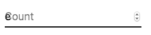
<TextField slotProps={{ inputLabel: { shrink: true } }} />or
<InputLabel shrink>Count</InputLabel>
Floating label
The floating label is absolutely positioned. It won't impact the layout of the page. Make sure that the input is larger than the label to display correctly.
type="number"
:::warning We do not recommend using
type="number" with a Text Field due to potential usability issues:- it allows certain non-numeric characters ('e', '+', '-', '.') and silently discards others
- the functionality of scrolling to increment/decrement the number can cause accidental and hard-to-notice changes
- and more—see Why the GOV.UK Design System team changed the input type for numbers for a more detailed explanation of the limitations of
<input type="number">:::
If you need a text field with number validation, you can use MUI Base's Number Input instead.
You can follow this GitHub issue to track the progress of introducing the Number Input component to Material UI.
Helper text
The helper text prop affects the height of the text field. If two text fields are placed side by side, one with a helper text and one without, they will have different heights. For example:
Please enter your name
import * as React from 'react';
import Box from '@mui/material/Box';
import TextField from '@mui/material/TextField';

export default function HelperTextMisaligned() {
  return (
    <Box sx={{ display: 'flex', alignItems: 'center', '& > :not(style)': { m: 1 } }}>
      <TextField
        helperText="Please enter your name"
        id="demo-helper-text-misaligned"
        label="Name"
      />
      <TextField id="demo-helper-text-misaligned-no-helper" label="Name" />
    </Box>
  );
}
This can be fixed by passing a space character to the
helperText prop:Please enter your name
import * as React from 'react';
import Box from '@mui/material/Box';
import TextField from '@mui/material/TextField';

export default function HelperTextAligned() {
  return (
    <Box sx={{ display: 'flex', alignItems: 'center', '& > :not(style)': { m: 1 } }}>
      <TextField
        helperText="Please enter your name"
        id="demo-helper-text-aligned"
        label="Name"
      />
      <TextField
        helperText=" "
        id="demo-helper-text-aligned-no-helper"
        label="Name"
      />
    </Box>
  );
}
Integration with 3rd party input libraries
You can use third-party libraries to format an input. You have to provide a custom implementation of the
<input> element with the inputComponent property.The following demo uses the react-imask and react-number-format libraries. The same concept could be applied to, for example react-stripe-element.
import * as React from 'react';
import { IMaskInput } from 'react-imask';
import { NumericFormat } from 'react-number-format';
import Stack from '@mui/material/Stack';
import Input from '@mui/material/Input';
import InputLabel from '@mui/material/InputLabel';
import TextField from '@mui/material/TextField';
import FormControl from '@mui/material/FormControl';

interface CustomProps {
  onChange: (event: { target: { name: string; value: string } }) => void;
  name: string;
}

const TextMaskCustom = React.forwardRef<HTMLInputElement, CustomProps>(
  function TextMaskCustom(props, ref) {
    const { onChange, ...other } = props;
    return (
      <IMaskInput
        {...other}
        mask="(#00) 000-0000"
        definitions={{
          '#': /[1-9]/,
        }}
        inputRef={ref}
        onAccept={(value: any) => onChange({ target: { name: props.name, value } })}
        overwrite
      />
    );
  },
);

export default function FormattedInputs() {
  const [values, setValues] = React.useState({
    textmask: '(100) 000-0000',
    numberformat: '1320',
  });

  const handleChange = (event: React.ChangeEvent<HTMLInputElement>) => {
    setValues({
      ...values,
      [event.target.name]: event.target.value,
    });
  };

  return (
    <Stack direction="row" spacing={2}>
      <FormControl variant="standard">
        <InputLabel htmlFor="formatted-text-mask-input">react-imask</InputLabel>
        <Input
          value={values.textmask}
          onChange={handleChange}
          name="textmask"
          id="formatted-text-mask-input"
          inputComponent={TextMaskCustom as any}
        />
      </FormControl>
      <NumericFormat
        value={values.numberformat}
        onChange={handleChange}
        customInput={TextField}
        thousandSeparator
        valueIsNumericString
        prefix="$"
        variant="standard"
        label="react-number-format"
      />
    </Stack>
  );
}
The provided input component should expose a ref with a value that implements the following interface:
interface InputElement {
  focus(): void;
  value?: string;
}const MyInputComponent = React.forwardRef((props, ref) => {
const { component: Component, ...other } = props;
// implement `InputElement` interface
React.useImperativeHandle(ref, () => ({
focus: () => {
// logic to focus the rendered component from 3rd party belongs here
},
// hiding the value e.g. react-stripe-elements
}));
// `Component` will be your `SomeThirdPartyComponent` from below
return <Component {...other} />;
});
// usage
<TextField
slotProps={{
input: {
inputComponent: MyInputComponent,
inputProps: {
component: SomeThirdPartyComponent,
},
},
/>;Accessibility
In order for the text field to be accessible, the input should be linked to the label and the helper text. The underlying DOM nodes should have this structure:
<div className="form-control">
  <label for="my-input">Email address</label>
  <input id="my-input" aria-describedby="my-helper-text" />
  <span id="my-helper-text">We'll never share your email.</span>
</div>
- If you are using the
TextFieldcomponent, you just have to provide a uniqueidunless you're using theTextFieldonly client-side. Until the UI is hydratedTextFieldwithout an explicitidwill not have associated labels. - If you are composing the component:
<FormControl>
  <InputLabel htmlFor="my-input">Email address</InputLabel>
  <Input id="my-input" aria-describedby="my-helper-text" />
  <FormHelperText id="my-helper-text">We'll never share your email.</FormHelperText>
</FormControl>
Supplementary projects
For more advanced use cases, you might be able to take advantage of:
- react-hook-form-mui: Material UI and react-hook-form combined.
- formik-material-ui: Bindings for using Material UI with formik.
- mui-rff: Bindings for using Material UI with React Final Form.
- @ui-schema/ds-material Bindings for using Material UI with UI Schema. JSON Schema compatible.