FUSE
DOCS
Nextjs
Reference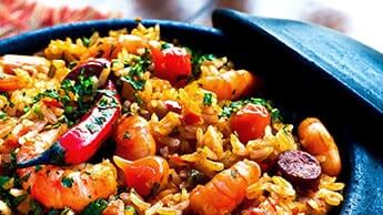
Card
Cards contain content and actions about a single subject.
Introduction
Cards are surfaces that display content and actions on a single topic. The Material UI Card component includes several complementary utility components to handle various use cases:
- Card: a surface-level container for grouping related components.
- Card Content: the wrapper for the Card content.
- Card Header: an optional wrapper for the Card header.
- Card Media: an optional container for displaying images, videos, etc.
- Card Actions: an optional wrapper that groups a set of buttons.
- Card Action Area: an optional wrapper that allows users to interact with the specified area of the Card.
Word of the Day
be•nev•o•lent
adjective
well meaning and kindly.
"a benevolent smile"
import * as React from 'react';
import Box from '@mui/material/Box';
import Card from '@mui/material/Card';
import CardActions from '@mui/material/CardActions';
import CardContent from '@mui/material/CardContent';
import Button from '@mui/material/Button';
import Typography from '@mui/material/Typography';

const bull = (
  <Box
    component="span"
    sx={{ display: 'inline-block', mx: '2px', transform: 'scale(0.8)' }}
  >
    •
  </Box>
);

export default function BasicCard() {
  return (
    <Card sx={{ minWidth: 275 }}>
      <CardContent>
        <Typography gutterBottom sx={{ color: 'text.secondary', fontSize: 14 }}>
          Word of the Day
        </Typography>
        <Typography variant="h5" component="div">
          be{bull}nev{bull}o{bull}lent
        </Typography>
        <Typography sx={{ color: 'text.secondary', mb: 1.5 }}>adjective</Typography>
        <Typography variant="body2">
          well meaning and kindly.
          <br />
          {'"a benevolent smile"'}
        </Typography>
      </CardContent>
      <CardActions>
        <Button size="small">Learn More</Button>
      </CardActions>
    </Card>
  );
}
Basics
import Card from '@mui/material/Card';
import CardContent from '@mui/material/CardContent';
:::success Although cards can support multiple actions, UI controls, and an overflow menu, use restraint and remember that cards are meant to be entry points to more complex and detailed information. :::
Outlined Card
Set
variant="outlined" to render an outlined card.Word of the Day
be•nev•o•lent
adjective
well meaning and kindly.
"a benevolent smile"
import * as React from 'react';
import Box from '@mui/material/Box';
import Card from '@mui/material/Card';
import CardActions from '@mui/material/CardActions';
import CardContent from '@mui/material/CardContent';
import Button from '@mui/material/Button';
import Typography from '@mui/material/Typography';

const bull = (
  <Box
    component="span"
    sx={{ display: 'inline-block', mx: '2px', transform: 'scale(0.8)' }}
  >
    •
  </Box>
);

const card = (
  <React.Fragment>
    <CardContent>
      <Typography gutterBottom sx={{ color: 'text.secondary', fontSize: 14 }}>
        Word of the Day
      </Typography>
      <Typography variant="h5" component="div">
        be{bull}nev{bull}o{bull}lent
      </Typography>
      <Typography sx={{ color: 'text.secondary', mb: 1.5 }}>adjective</Typography>
      <Typography variant="body2">
        well meaning and kindly.
        <br />
        {'"a benevolent smile"'}
      </Typography>
    </CardContent>
    <CardActions>
      <Button size="small">Learn More</Button>
    </CardActions>
  </React.Fragment>
);

export default function OutlinedCard() {
  return (
    <Box sx={{ minWidth: 275 }}>
      <Card variant="outlined">{card}</Card>
    </Box>
  );
}
Complex Interaction
On desktop, card content can expand. (Click the downward chevron to view the recipe.)
R
Shrimp and Chorizo PaellaSeptember 14, 2016
This impressive paella is a perfect party dish and a fun meal to cook together with your guests. Add 1 cup of frozen peas along with the mussels, if you like.
import * as React from 'react';
import { styled } from '@mui/material/styles';
import Card from '@mui/material/Card';
import CardHeader from '@mui/material/CardHeader';
import CardMedia from '@mui/material/CardMedia';
import CardContent from '@mui/material/CardContent';
import CardActions from '@mui/material/CardActions';
import Collapse from '@mui/material/Collapse';
import Avatar from '@mui/material/Avatar';
import IconButton, { IconButtonProps } from '@mui/material/IconButton';
import Typography from '@mui/material/Typography';
import { red } from '@mui/material/colors';
import FavoriteIcon from '@mui/icons-material/Favorite';
import ShareIcon from '@mui/icons-material/Share';
import ExpandMoreIcon from '@mui/icons-material/ExpandMore';
import MoreVertIcon from '@mui/icons-material/MoreVert';
interface ExpandMoreProps extends IconButtonProps {
expand: boolean;
}
const ExpandMore = styled((props: ExpandMoreProps) => {
const { expand, ...other } = props;
return <IconButton {...other} />;
})(({ theme }) => ({
marginLeft: 'auto',
transition: theme.transitions.create('transform', {
duration: theme.transitions.duration.shortest,
}),
variants: [
{
props: ({ expand }) => !expand,
style: {
transform: 'rotate(0deg)',
},
},
{
props: ({ expand }) => !!expand,
style: {
transform: 'rotate(180deg)',
},
},
],
}));
export default function RecipeReviewCard() {
const [expanded, setExpanded] = React.useState(false);
const handleExpandClick = () => {
setExpanded(!expanded);
};
return (
<Card sx={{ maxWidth: 345 }}>
<CardHeader
avatar={
<Avatar sx={{ bgcolor: red[500] }} aria-label="recipe">
R
</Avatar>
}
action={
<IconButton aria-label="settings">
<MoreVertIcon />
</IconButton>
}
title="Shrimp and Chorizo Paella"
subheader="September 14, 2016"
/>
<CardMedia
component="img"
height="194"
image="/material-ui-static/images/cards/paella.jpg"
alt="Paella dish"
/>
<CardContent>
<Typography variant="body2" sx={{ color: 'text.secondary' }}>
This impressive paella is a perfect party dish and a fun meal to cook
together with your guests. Add 1 cup of frozen peas along with the mussels,
if you like.
</Typography>
</CardContent>
<CardActions disableSpacing>
<IconButton aria-label="add to favorites">
<FavoriteIcon />
</IconButton>
<IconButton aria-label="share">
<ShareIcon />
</IconButton>
<ExpandMore
expand={expanded}
onClick={handleExpandClick}
aria-expanded={expanded}
aria-label="show more"
>
<ExpandMoreIcon />
</ExpandMore>
</CardActions>
<Collapse in={expanded} timeout="auto" unmountOnExit>
<CardContent>
<Typography sx={{ marginBottom: 2 }}>Method:</Typography>
<Typography sx={{ marginBottom: 2 }}>
Heat 1/2 cup of the broth in a pot until simmering, add saffron and set
aside for 10 minutes.
</Typography>
<Typography sx={{ marginBottom: 2 }}>
Heat oil in a (14- to 16-inch) paella pan or a large, deep skillet over
medium-high heat. Add chicken, shrimp and chorizo, and cook, stirring
occasionally until lightly browned, 6 to 8 minutes. Transfer shrimp to a
large plate and set aside, leaving chicken and chorizo in the pan. Add
pimentón, bay leaves, garlic, tomatoes, onion, salt and pepper, and cook,
stirring often until thickened and fragrant, about 10 minutes. Add
saffron broth and remaining 4 1/2 cups chicken broth; bring to a boil.
</Typography>
<Typography sx={{ marginBottom: 2 }}>
Add rice and stir very gently to distribute. Top with artichokes and
peppers, and cook without stirring, until most of the liquid is absorbed,
15 to 18 minutes. Reduce heat to medium-low, add reserved shrimp and
mussels, tucking them down into the rice, and cook again without
stirring, until mussels have opened and rice is just tender, 5 to 7
minutes more. (Discard any mussels that don't open.)
</Typography>
<Typography>
Set aside off of the heat to let rest for 10 minutes, and then serve.
</Typography>
</CardContent>
</Collapse>
</Card>
);
}Media
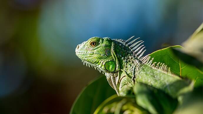
Example of a card using an image to reinforce the content.
Lizard
Lizards are a widespread group of squamate reptiles, with over 6,000 species, ranging across all continents except Antarctica
import * as React from 'react';
import Card from '@mui/material/Card';
import CardActions from '@mui/material/CardActions';
import CardContent from '@mui/material/CardContent';
import CardMedia from '@mui/material/CardMedia';
import Button from '@mui/material/Button';
import Typography from '@mui/material/Typography';

export default function MediaCard() {
  return (
    <Card sx={{ maxWidth: 345 }}>
      <CardMedia
        sx={{ height: 140 }}
        image="/material-ui-static/images/cards/contemplative-reptile.jpg"
        title="green iguana"
      />
      <CardContent>
        <Typography gutterBottom variant="h5" component="div">
          Lizard
        </Typography>
        <Typography variant="body2" sx={{ color: 'text.secondary' }}>
          Lizards are a widespread group of squamate reptiles, with over 6,000
          species, ranging across all continents except Antarctica
        </Typography>
      </CardContent>
      <CardActions>
        <Button size="small">Share</Button>
        <Button size="small">Learn More</Button>
      </CardActions>
    </Card>
  );
}
By default, we use the combination of a
<div> element and a background image to display the media. It can be problematic in some situations, for example, you might want to display a video or a responsive image. Use the component prop for these use cases:Lizard
Lizards are a widespread group of squamate reptiles, with over 6,000 species, ranging across all continents except Antarctica
import * as React from 'react';
import Card from '@mui/material/Card';
import CardActions from '@mui/material/CardActions';
import CardContent from '@mui/material/CardContent';
import CardMedia from '@mui/material/CardMedia';
import Button from '@mui/material/Button';
import Typography from '@mui/material/Typography';

export default function ImgMediaCard() {
  return (
    <Card sx={{ maxWidth: 345 }}>
      <CardMedia
        component="img"
        alt="green iguana"
        height="140"
        image="/material-ui-static/images/cards/contemplative-reptile.jpg"
      />
      <CardContent>
        <Typography gutterBottom variant="h5" component="div">
          Lizard
        </Typography>
        <Typography variant="body2" sx={{ color: 'text.secondary' }}>
          Lizards are a widespread group of squamate reptiles, with over 6,000
          species, ranging across all continents except Antarctica
        </Typography>
      </CardContent>
      <CardActions>
        <Button size="small">Share</Button>
        <Button size="small">Learn More</Button>
      </CardActions>
    </Card>
  );
}
Primary action
Often a card allow users to interact with the entirety of its surface to trigger its main action, be it an expansion, a link to another screen or some other behavior. The action area of the card can be specified by wrapping its contents in a
CardActionArea component.import * as React from 'react';
import Card from '@mui/material/Card';
import CardContent from '@mui/material/CardContent';
import CardMedia from '@mui/material/CardMedia';
import Typography from '@mui/material/Typography';
import CardActionArea from '@mui/material/CardActionArea';
export default function ActionAreaCard() {
return (
<Card sx={{ maxWidth: 345 }}>
<CardActionArea>
<CardMedia
component="img"
height="140"
image="/material-ui-static/images/cards/contemplative-reptile.jpg"
alt="green iguana"
/>
<CardContent>
<Typography gutterBottom variant="h5" component="div">
Lizard
</Typography>
<Typography variant="body2" sx={{ color: 'text.secondary' }}>
Lizards are a widespread group of squamate reptiles, with over 6,000
species, ranging across all continents except Antarctica
</Typography>
</CardContent>
</CardActionArea>
</Card>
);
}A card can also offer supplemental actions which should stand detached from the main action area in order to avoid event overlap.
import * as React from 'react';
import Card from '@mui/material/Card';
import CardContent from '@mui/material/CardContent';
import CardMedia from '@mui/material/CardMedia';
import Typography from '@mui/material/Typography';
import Button from '@mui/material/Button';
import CardActionArea from '@mui/material/CardActionArea';
import CardActions from '@mui/material/CardActions';

export default function MultiActionAreaCard() {
  return (
    <Card sx={{ maxWidth: 345 }}>
      <CardActionArea>
        <CardMedia
          component="img"
          height="140"
          image="/material-ui-static/images/cards/contemplative-reptile.jpg"
          alt="green iguana"
        />
        <CardContent>
          <Typography gutterBottom variant="h5" component="div">
            Lizard
          </Typography>
          <Typography variant="body2" sx={{ color: 'text.secondary' }}>
            Lizards are a widespread group of squamate reptiles, with over 6,000
            species, ranging across all continents except Antarctica
          </Typography>
        </CardContent>
      </CardActionArea>
      <CardActions>
        <Button size="small" color="primary">
          Share
        </Button>
      </CardActions>
    </Card>
  );
}
UI Controls
Supplemental actions within the card are explicitly called out using icons, text, and UI controls, typically placed at the bottom of the card.
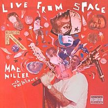
Here's an example of a media control card.
Live From Space
Mac Miller
import * as React from 'react';
import { useTheme } from '@mui/material/styles';
import Box from '@mui/material/Box';
import Card from '@mui/material/Card';
import CardContent from '@mui/material/CardContent';
import CardMedia from '@mui/material/CardMedia';
import IconButton from '@mui/material/IconButton';
import Typography from '@mui/material/Typography';
import SkipPreviousIcon from '@mui/icons-material/SkipPrevious';
import PlayArrowIcon from '@mui/icons-material/PlayArrow';
import SkipNextIcon from '@mui/icons-material/SkipNext';

export default function MediaControlCard() {
  const theme = useTheme();

  return (
    <Card sx={{ display: 'flex' }}>
      <Box sx={{ display: 'flex', flexDirection: 'column' }}>
        <CardContent sx={{ flex: '1 0 auto' }}>
          <Typography component="div" variant="h5">
            Live From Space
          </Typography>
          <Typography
            variant="subtitle1"
            component="div"
            sx={{ color: 'text.secondary' }}
          >
            Mac Miller
          </Typography>
        </CardContent>
        <Box sx={{ display: 'flex', alignItems: 'center', pl: 1, pb: 1 }}>
          <IconButton aria-label="previous">
            {theme.direction === 'rtl' ? <SkipNextIcon /> : <SkipPreviousIcon />}
          </IconButton>
          <IconButton aria-label="play/pause">
            <PlayArrowIcon sx={{ height: 38, width: 38 }} />
          </IconButton>
          <IconButton aria-label="next">
            {theme.direction === 'rtl' ? <SkipPreviousIcon /> : <SkipNextIcon />}
          </IconButton>
        </Box>
      </Box>
      <CardMedia
        component="img"
        sx={{ width: 151 }}
        image="/material-ui-static/images/cards/live-from-space.jpg"
        alt="Live from space album cover"
      />
    </Card>
  );
}
Active state styles
To customize a Card's styles when it's in an active state, you can attach a
data-active attribute to the Card Action Area component and apply styles with the &[data-active] selector, as shown below:import * as React from 'react';
import Box from '@mui/material/Box';
import Card from '@mui/material/Card';
import CardContent from '@mui/material/CardContent';
import Typography from '@mui/material/Typography';
import CardActionArea from '@mui/material/CardActionArea';
const cards = [
{
id: 1,
title: 'Plants',
description: 'Plants are essential for all life.',
},
{
id: 2,
title: 'Animals',
description: 'Animals are a part of nature.',
},
{
id: 3,
title: 'Humans',
description: 'Humans depend on plants and animals for survival.',
},
];
function SelectActionCard() {
const [selectedCard, setSelectedCard] = React.useState(0);
return (
<Box
sx={{
width: '100%',
display: 'grid',
gridTemplateColumns: 'repeat(auto-fill, minmax(min(200px, 100%), 1fr))',
gap: 2,
}}
>
{cards.map((card, index) => (
<Card>
<CardActionArea
onClick={() => setSelectedCard(index)}
data-active={selectedCard === index ? '' : undefined}
sx={{
height: '100%',
'&[data-active]': {
backgroundColor: 'action.selected',
'&:hover': {
backgroundColor: 'action.selectedHover',
},
},
}}
>
<CardContent sx={{ height: '100%' }}>
<Typography variant="h5" component="div">
{card.title}
</Typography>
<Typography variant="body2" color="text.secondary">
{card.description}
</Typography>
</CardContent>
</CardActionArea>
</Card>
))}
</Box>
);
}
export default SelectActionCard;🎨 If you are looking for inspiration, you can check MUI Treasury's customization examples.